Aruna Sonwe – character design

Here is a character design and concept art piece I did last year.

I created her for a world I am building and as an exercise mixing 2D/3D techniques.
She is a warrior ranger capable of limited spellcasting. She works as an honored soldier and ranger, having vast experience in the wild prairies and dry, hot fields that make her home. I was inspired by many places for this character, including Brazil’s cangaceiros for the clothes, shapes and designs.

GD_Aruna2

Final concept, with different views

GD_Aruna

Another image, only with the items and text

aruna_mof1

I started with a base can mesh and sculpted a different face, taking some renders to Photoshop

aruna_mof4

Then I posed the model and later worked on Photoshop to go for the clothes and armors.

aruna_mof2

I used Marvelous Designer for the folds and and simulation

aruna_mof3

Which I later exported to 3ds Max to light and render

aruna_mof5

Raw renders and views

Inktober 2016 – part II

Second part of my 2016 Inktober about brazilian folklore.

Click on the images for a brief description.

Inktober 2016 – part I

Back in 2016 I did an Inktober based on brazilian folklore. Here is the first part of all images I made. Click on each one to read a small description.

Xangô / Sango – lord of lighting

Hi folks,

Last year I did a new yoruba deity, this time for a Nigerian comics series called “Spirit Wars” from Vortex Comics.

Now I am able to show it to you.

xango_final

Final image

This is Xangô / Sango, one of the main orishas of the afro-brazilian and yoruba religions. Continuing the line I started with my previous Yemoja / Iemanjá, I wanted to show him using more details that connected him to his origins, to Africa.

xango_mof2.jpg

Some of the images used as references and the books I read to do my research

According to my research (mostly based on brazilian religions), he is a deity of justice, fire, ligthning and stone. From the stories I have read and worshipping methods, he was a prince and warrior, with a reckless temperament. Usually worshipped with the colors white, red and brown, he is also depicted in the religions shirtless and with dreads. I also wanted to show him with his thunder stone pouch and wood object that controls rain.

xango_concepts1

First batch of concepts. Trying to find the right balance between prince/fire and thunder deity/warrior

xango_concepts2

Second batch of concepts. Further exploration of ornaments and headdresses, this time using a bit more the axe and lightning motifs.

xango_concepts3

Final design and axe shape exploration

Based on all of it I tried to put some elements that showed fire and lighting and also justice and balance (such as the diamond shape in the body paint). The double-bitted axe, called oxé, was based on real designs of it that are used for worship, as well as yoruba wood sculptures.

xango_mof4

3ds Max viewports, showing some shaders and lighting setup

xango_mof3

ZBrush screens of oxé

xango_oxe

Final Oxé design

“As Verdades do Turunã” RPG adventure – characters

Following my previous post, here are the five characters I designed for the RPG adventure “As Verdades do Turunã” (The Turunã Truths, as a free translation), for the fantasy book and project by Ian Fraser “Araruama – O livro das sementes”, based on latin american cultures.

Click on the images for the high res version.

yaax

Yáax Núuk

nelli

Nelli Ehecatl

cocijo

Cocijo Huehueteotli

yaotl

Yaotl Tlanectic

apo-mayta

Apo-Mayta Khuno

cocijo_esbocos01

Cocijo sketches

yaax_esbocos1

Yáax sketches

yaotl_esbocos01

Yaotl sketches

Stephen King’s “It” Pennywise Design – part III

Now, it was time to go for the clothing.

I have been recently using Marvelous Designer for clothes and physical simulations, so here are some screens of it in action. I’m no expert in it, so don’t expect to see perfect seams and parts.
I bought a clown costume from TurboSquid to serve as a starting point, to help with the design.

I also exported the model to Mixamo for rigging and then went to pose it in 3ds Max.

pennywise_marvelous.jpg

Marvelous Designer screens, showing both poses

After some tests, it became clear I needed to make a full realised illustration.

pennywise_clothes1

At first I thought only about making the character in a pose, with no detailed background

So I put him in a sewer and changed the lighting to make it more dramatic.

The pose was a reference to my old drawing, updated to show the character calling you closer, but also at the beginning of a walk towards its prey. I also later added a skull and a paper boat to the background.

pennywise_3dsmax2

I used 3ds Max, ZBrush and Photoshop for the models, textures and editing


Stephen King’s “It” Pennywise Design – part II

Continuing the design process, I wanted to go 3D for the final image since the beginning.

So, at this point, it was time to go to ZBrush and work on a bust.
My idea was to make a full body figure, but the bust and face are key points in character design. So, if I could get it right, I was in the right track.

I used an Adobe Fuse model for the base mesh and did a quick render and some paintovers in Photoshop.

I decide to try the “shiny silver eyes” and evil grinning versions described in the book just to see how it looked.

pennywise_busto1_1

Number 18, exploring how the design would translate to 3D

pennywise_busto1_2

Number 19, showing a yellow tie – I changed its color to better fit within the color scheme

After these tests and being more advanced in the book, it became clear to me that the second version (number 18 of the previous post) was better suited for the final concept.

I then went and worked a bit on the face, giving it more expression and unique features.

pennywise_busto2_1

I decided to make the hair shorter to be less comical and unrealistic

This third version had me happier with the result. I tried the blue eyes described in its first appearance in the book, as well as the predatory yellow ones, also shown in both films (new and old). I also made the eyes a bit off, again inspired by the new Pennywise version (because it looks creepier too).

I then went to ZBrush and made some refinements in the face.

pennywise_zbrush1

First refinement. I wanted more expression

pennywise_zbrush2

Final version, having a good balance between expression and creepiness

Having decided for a final one, I went back to the paintover and updated it, as well as the evil grim version.

pennywise_bust_final1

Final concept

pennywise_bust_final2

Final evil concept

Now, it was time to go for the clothes and the illustration.

(continues)

Stephen King’s “It” Pennywise Design – part I

-THIS POST MAY CONTAIN SOME SPOILERS FROM THE BOOK-


“A figure was standing in those tangled weeds and low bushes, almost out of sight. It held a clutch of balloons – red, yellow, blue, green – in one white-gloved hand. It beckoned with the other. He couldn’t see the figure’s face, but he could see the baggy suit with the big orange pompom-buttons down the front and the floppy yellow bow-tie. It was a clown.”
King, Stephen. IT (pp. 223-224)


Hi everyone,

Inspired by the new film “IT” and the book, I decide to make my own version of Pennywise, using the original material as a guiding point.

The new Pennywise is a master piece. They got so many things right. So, with a little bit of the new version as an inspiration too, I started my other version, many years after my first one.

I acquired the book in Brazil back in 2000-2002. I used to make many drawings with colored pencils and my trusty Pentel mechanical pencil.

livro_acoisa

The 2000s edition I have, the one I read, showing its age. I love this cover

I did read the book at the time, but only a quarter of it. It was too big, and too scary. But Pennywise stuck with me, and I did some images of it at the time, one of which is below.

pennywise_antigo

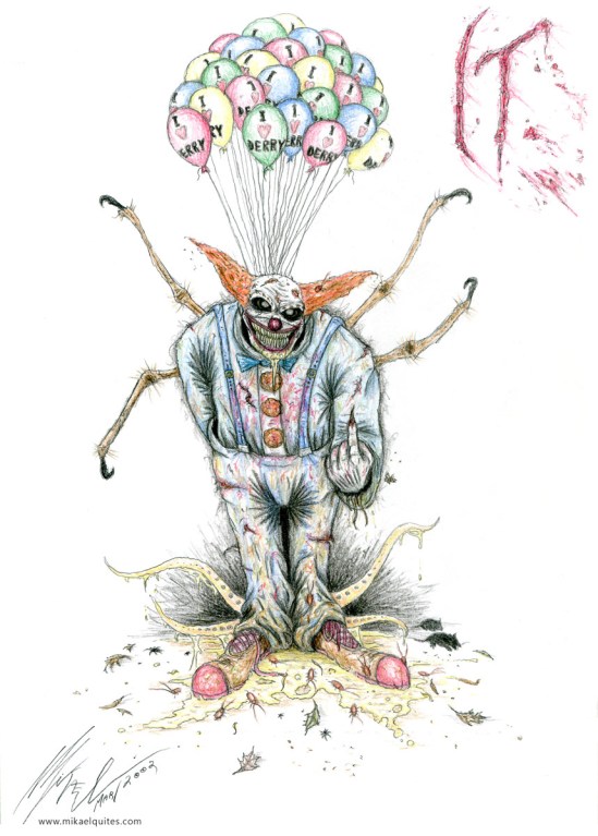
His blue bow tie is taken from his first description in the book

Now, 15 years later, I wanted to make a new interpretation of him, this time using 3D and new tools I’ve learned.

I then started rereading the book, making my reinterpretation as I went along.

Based on the book I got the following guidelines:

-Looks like a cross between Ronald McDonald, Bozo and Clarabell;
-He wears a baggy, white-silver suit;
-He has two tufts of hair on each side of its bald head;
-Wears white makeup on the face;
-White gloves in the hands;
-Has large orange pompom-buttons in the front of the suit;
-Has blood red makeup on its face, making a clown smile;
-Wears funny, oversized shoes;
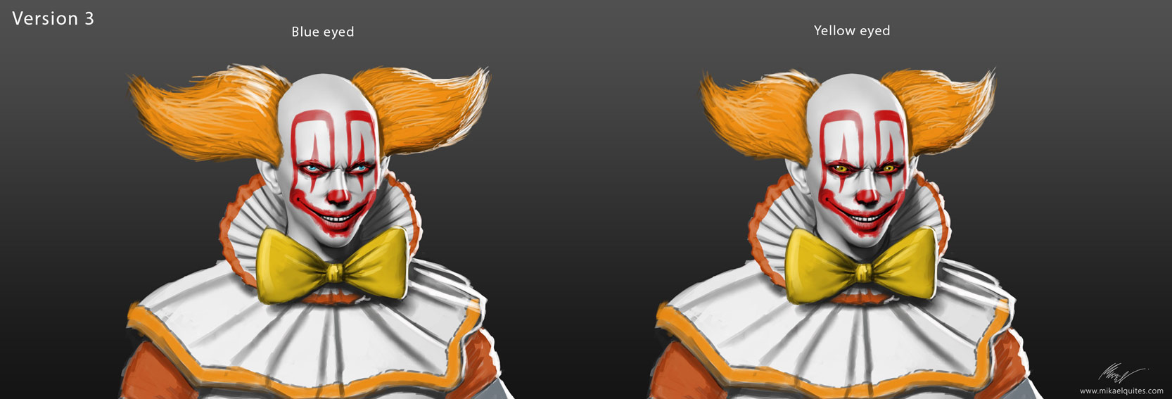
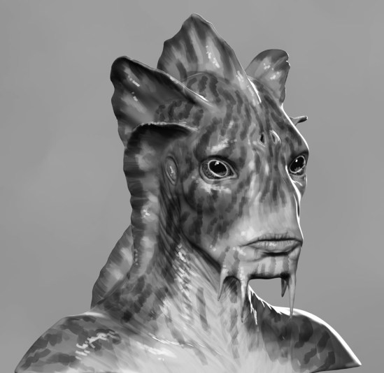
-Has sometimes yellow, predatory eyes, sometimes sliver shiny, like a coin, sometimes blue, inviting;
-Had to be a mix between a predator and a funny clown;

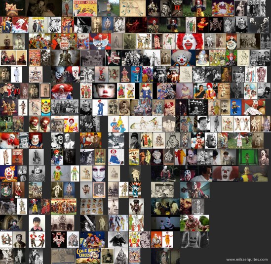
Before I started with the design, I gathered as much references as I could.
As the story takes place in the USA, I studied a bit of clown history in that country as well as England’s. The entity is very old, so many of my refs are from vintage, early 1900s clowns. Some references are also from the time the story first takes place, the 1950s and 1960s. I also searched for old toys and furniture.

Here is an image of most of my references packed together:

pennywise_mikael_refs

So I started with the basic, lines and base colors, as I went reading.

pennywise_concepts_all1.jpg

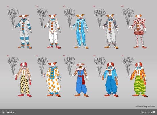
The first concepts, trying to give it some variation

When he first shows up, here is its first description (all quotes in this post are from the Kindle version):

“It was a clown, like in the circus or on TV. In fact he looked like a cross between Bozo and Clarabell, who talked by honking his (or was it her? – George was never really sure of the gender) horn on Howdy Doody Saturday mornings – Buffalo Bob was just about the only one who could understand Clarabell, and that always cracked George up. The face of the clown in the stormdrain was white, there were funny tufts of red hair on either side of his bald head, and there was a big clown-smile painted over his mouth. If George had been inhabiting a later year, he would have surely thought of Ronald McDonald before Bozo or Clarabell. The clown held a bunch of balloons, all colors, like gorgeous ripe fruit in one hand.”
(p. 15)
“How, George wondered, could I have thought his eyes were yellow? They were a bright, dancing blue, the color of his mom’s eyes, and Bill’s.”
(p. 16)
“He was wearing a baggy silk suit with great big orange buttons. A bright tie, electric-blue, flopped down his front, and on his hands were big white gloves, like the kind Mickey Mouse and Donald Duck always wore.”
(p. 16)


So I went using blue along the designs, both as a nod to the blue tie and eyes. Later it became clear to me that blue was not right, because his suit was actually silver and white:

“The figure was dressed in what appeared to be a white-silver clown suit.”
(p. 254)
“And there was the clown in the background, wearing his silver suit with the orange buttons(…)”
(pp. 878-879)


The real clown references were a big concern of mine.
Bozo, Clarabell and Ronald McDonald.

“(…)a clown which had looked like a cross between Ronald McDonald and Bozo, according to Hagarty.”
(p. 602)

Bozo had his big, curved hair, interesting gloves and white shape on its neck. Clarabell had its weird makeup and nice, vintage folds in its neck too. Ronald had its baggy suit and stripes.


As for the makeup, some guides:

“He was just like Ben and Bill said. Silver suit, orange buttons, white make-up on his face, big red smile. I don’t know if it was lipstick or make-up, but it looked like blood.”
(p. 858)
“The funny fellow had a huge grin on his face. He wore no make-up (except to Bill his whole face looked like make-up), but he was bald except for two tufts of hair that stuck up like horns over his ears, and Bill had no trouble recognizing their clown.”
(p. 876)

The second group of concepts explores these new points:

pennywise_concepts_all2.jpg

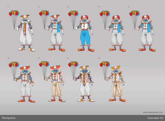
Here I tried to narrow the choices, mixing details and shapes between options

I decide to stick with the bow tie, since it was interesting in the overall design.
But I was still in doubt with the blue.

To me it seemed that numbers 18 and 19 were worth taking to the next step, as they brought the best of what I tought was in the book.

(continues)


Curso de Design de Personagens – PUCRS

design-de-personagens-01-01

(portuguese only)

Olá galera,

Dias 09, 10 e 11 de maio vou dar um curso de extensão de Design de Personagens na FAMECOS, PUCRS, em Porto Alegre.

Vai ser um curso que vai abordar desde conceitos de design e Gestalt, até direitos autorais, passando por noções de anatomia, gesto, tipos de linhas e esboço.

Indico para quem tem interesse na área e quer se aprimorar e também para quem está iniciando, um curso para todos os níveis.

Para fazer a inscrição e saber mais, cliquem na imagem do post ou acessem http://educon.pucrs.br/cursos/design-de-personagens/

Se tiverem alguma dúvida podem entrar em contato comigo.

Iemanjá/Yemoja

iemanja_final

Hi everyone,

Here is a new work I did.
This is Iemanjá/Yemoja, one of the main orishas of the afro-brazilian and yoruba religions. I wanted to show a different version of her, inspired by the shapes and powers of the sea. I did this image for the wonderful “Contos de Òrun Àiyé”, a comic book project by Hugo Canuto. More details about it here (portuguese only).

iemanja_makingof_01

I did a good research, learning some important aspects of her: she is a mother, queen of the sea, sometimes called and depicted as a mermaid. Symbols: the waning moon, starfish, waves, pearls.

iemanja_makingof_02

I ended up with the mermaid version, since in my opinion it was more primal and symbolic and had a good balance between power and beauty with a unique shape and silhouette.

iemanja_makingof_03

The final design is made to enhance the mother characteristics: big belly and breasts, the body paint of the womb (she gave birth to almost all deities). You can see my exploration and final design of the fan/mirror.

And here is a little making of.

Potira and Mapinguari

Hi everyone,

Here is an art for the upcoming game “Potira”. It takes place in the Amazon and follows a female indian called Potira.

The Mapinguari is a folklore creature that inhabits the Amazon jungle. Some say it is a huge one eyed ape with dark fur that eats people. Others, that it is a reminiscent of the Giant Sloth, which coexisted with indigenous people in the past. I chose the latter to make good character and similar to a tuxaua (leader), that would aid you on your quest.

potira_mapinguari_cena

Orixás – Oxalá

orixas_oxala_final

The main, more realistic version

This is my take on Oxalá / Oxalufã / Obatalá, one of the main deities of the Candomblé and Umbanda brazilian religions.

I have always been fascinated by the intricacies of the great Orixá pantheon, with so many unique characters.
I decided to start studying and getting deeper into the legends, beliefs and rich stories to portray each Orixá / Orisha.

Oxalá / Obatalá is one of the oldest and most powerful orixás, being responsible for the birth of human beings and the creation of the world. Its color is white and it carries a wooden scepter called opaxorô, which it can use to divide the world in two, if needed.

I went for a more african design, since the original beliefs came from the yoruba people of Africa. The crown is based on the nigerian yoruba crown, or ade / adenla. I decided to make the beads longer to represent power and mystery.

oxala02

An alternative version, trying a cartoon style

oxala03

Another quick alternative version, going for more details in the dress and beads

orixas_oxala_sketches1

I first start with pencil sketches, exploring different ideas

orixas_oxala_makingof_max

Then I went to 3ds Max to quickly model the character to help with 2D

orixas_oxala_makingof02

The beauty pass + ambient occlusion

orixas_oxala_sketches2

I decided to go back to pencil drawings to help with the pose and overall design. This is how I came up with the crown

orixas_oxala_wip15

Starting to integrate things and doing a paintover

orixas_oxala_ornamentostodos

The ornaments I did for the main design. Some I didn’t end up using